
In an era where our lives are increasingly intertwined with the digital realm, providing users with an optimal web experience has become more important than ever. From browsing the latest news to shopping online to accessing essential services, the web has become an indispensable part of our everyday lives. However, to truly enhance the user experience, it is essential to mobilize your web and unlock its full potential. In this article, we will delve into the art of optimizing user experiences on the web, exploring innovative strategies and techniques that will revolutionize the way users interact with your online platform. So, buckle up and get ready to embark on a journey that will transform your web presence and captivate your audience like never before. It’s time to mobilize and unleash the magic of an extraordinary user experience! 

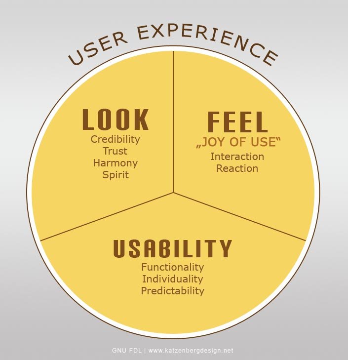
In today’s digital era, mobile optimization has become more crucial than ever before. It is no secret that the number of mobile users accessing the internet has skyrocketed in recent years. In fact, studies show that mobile devices account for over 50% of overall web traffic. With such a significant portion of users relying on their smartphones and tablets, it is essential for businesses to adapt their websites to ensure a seamless user experience across all devices.rnrnResponsive web design is the key to unlocking the potential of mobile optimization. By implementing a fluid design that adjusts seamlessly to different screen sizes and resolutions, responsive websites provide users with a consistent and optimized browsing experience. Best practices for responsive web design include using media queries to adjust layout and font sizes, optimizing images for different devices, and utilizing flexible grids and breakpoints. Additionally, ensuring that your website is mobile-friendly not only improves user experience but also has a positive impact on search engine rankings, as search engines prioritize mobile-friendly sites in their results.rnrnrnOne aspect of mobile optimization that often goes overlooked is page load times. Slow loading websites can lead to high bounce rates, frustrated users, and missed business opportunities. Fortunately, there are strategies and tools available to accelerate mobile page load times. Compressing images, leveraging caching techniques, and minifying code are just a few ways to optimize your website’s performance. Additionally, utilizing content delivery networks (CDNs) and AMP (Accelerated Mobile Pages) can significantly enhance user experience by delivering content faster and more efficiently. By prioritizing efficient page load times, businesses can ensure that their mobile-optimized websites don’t just look good, but also perform exceptionally well, providing users with a truly seamless mobile browsing experience.rnrnrnDesigning mobile-first experiences is crucial in today’s mobile-centric world. When creating engaging mobile-first experiences, it is important to consider design principles that captivate and retain users. Simplified navigation, clear call-to-actions, and visually appealing content are fundamental elements in creating an engaging mobile experience. Additionally, ensuring that your website is touch-friendly, with buttons and links that are easily clickable on smaller screens, can further enhance user engagement. By embracing a mobile-first mindset, designers can prioritize crucial elements, streamline content, and ultimately deliver a user experience that leaves a lasting impression. In conclusion, mobilizing your web presence through responsive design, optimizing page load times, and creating engaging mobile-first experiences ensures that your website is poised to deliver optimal user experiences across all devices, captivating your audience and keeping them coming back for more.
Q&A
Q: Why should I bother mobilizing my web design?
A: Mobilizing your web design is crucial in today’s mobile-first digital landscape. By optimizing the user experience for mobile devices, you’ll harness a broader audience, boost engagement, and stay ahead of your competition.
Q: How can I ensure an optimal user experience on mobile devices?
A: To unlock an optimal user experience, start by embracing responsive design techniques. Create visually stunning and easy-to-navigate websites that adapt seamlessly to different screen sizes. Prioritize fast loading times, well-organized content, and intuitive touch-friendly interfaces.
Q: Are there any specific design elements I should focus on for mobile optimization?
A: Absolutely! Consider simplifying navigation menus, minimizing the number of clicks required to access content, and implementing convenient search features. Opt for larger fonts and buttons to facilitate effortless interaction. Also, don’t forget to utilize high-quality visuals that enhance your brand’s message on smaller screens.
Q: How important is content optimization for mobile users?
A: Content optimization plays a significant role in ensuring a superior mobile user experience. Tailor your content for mobile consumption by using concise and engaging messaging. Break up long text into smaller paragraphs, incorporate bullet points, and make use of visuals, such as images and videos, to deliver information effectively.
Q: Do I need an app or a mobile-friendly website?
A: It depends on your specific goals and target audience. An app can provide a more personalized and immersive experience, with the ability to leverage device-specific features. However, developing and maintaining an app can be costly. Alternatively, a mobile-friendly website can be a cost-effective solution that caters to a wide range of devices, working across platforms.
Q: How do I test the mobile-friendliness of my website?
A: To test the mobile-friendliness of your website, utilize tools like Google’s Mobile-Friendly Test. Additionally, conduct real-user testing on various mobile devices to ensure compatibility and smooth functionality. Regularly review your website’s performance metrics and feedback to identify areas for improvement.
Q: What are some common mistakes to avoid when mobilizing my web design?
A: Avoid using large image files that slow down page load times, such as uncompressed or unoptimized images. Sidestep complex navigation structures that confuse mobile users. Lastly, be cautious with pop-ups, excessive ads, and hard-to-dismiss banners that can hinder the user experience.
Q: How can I stay updated with the latest mobile design trends?
A: Stay in the loop by actively following industry-leading blogs, attending webinars, or participating in relevant forums. Engage with a community of like-minded designers and leverage social media to discover emerging trends. Additionally, keep an eye on successful mobile applications and adapt relevant design elements to your own website.
Q: What impact will a mobile-optimized web design have on my business?
A: A mobile-optimized web design will significantly enhance your business’s online visibility, user engagement, and conversion rates. It will enable you to capture a larger share of the mobile audience, enhance your brand reputation, and establish yourself as a leader in your industry. By prioritizing a user-friendly mobile experience, you’ll effectively position yourself above competitors who overlook this critical aspect. As we conclude our exploration into the world of mobile web optimization, we can’t help but marvel at the immense transformative power it possesses. The untapped potential of unlocking an optimal user experience is no longer a distant dream but a tangible reality, inviting both creators and consumers alike to embark on a new era of seamless digital interaction.
From the bustling streets of Cairo to the serene landscapes of Kyoto, mobile devices have become the portals through which we access information, connect with one another, and immerse ourselves in the vast ocean of knowledge at our fingertips. It is here, in this interconnected realm, that the mobilization of the web reigns supreme.
By prioritizing mobile web optimization, we are not merely adapting to a new technological landscape; we are revolutionizing the way we engage with the digital universe. From intuitive navigation to lightning-fast load times, each element we optimize is like a brushstroke on the canvas of user experience, sculpting an engaging and fluid environment that captivates and delights.
But the true beauty of mobile web optimization lies not only in its artistic allure but also in its tangible benefits. Businesses can expand their reach, foster customer loyalty, and elevate their brand identity through an unforgettable user journey. Content creators can unleash their creativity with confidence, knowing that their work will be seamlessly delivered to eager audiences, regardless of the device they choose to utilize.
Above all, mobile web optimization empowers us, the users, to traverse the digital realm without limitations. It enables us to seamlessly transition from the palm of our hand to the desk in our office, from the cozy corners of our homes to the towering skyscrapers that adorn our cities. It allows us to experience the web in all its splendor, unencumbered by the boundaries of time or space.
As we bid farewell to this immersive journey through the intricacies of mobile web optimization, we urge you to seize the reins of this remarkable revolution. Unlock the potential of your digital presence, unleash the boundless creativity within, and embrace the infinite possibilities that come with mobilizing your web. Remember, the key to an optimal user experience lies not only in the technological wizardry behind it, but in the heart and soul of the captivating stories that await to be told. So go forth, dear reader, and mobilize your web like never before.