

In the ever-evolving realm of website rankings, staying on top of the latest trends and algorithm updates is vital to ensuring your online success. And in today’s mobile-dominated world, mastering mobile-first indexing has become a crucial goal for every website owner aiming to boost their Google rankings. With this groundbreaking shift in the way search engines evaluate and rank websites, now is the time to plunge into the depths of mobile-first indexing and emerge with strategies that will skyrocket your website’s visibility and overall performance. So fasten your seatbelts and get ready to embark on a thrilling journey that will unveil the secrets to mastering mobile-first indexing and paving your way to digital triumph.
Table of Contents
- Understanding the Importance of Mobile-First Indexing in Google Rankings
- Optimizing Your Website for Mobile-First Indexing: Key Strategies and Best Practices
- Enhancing User Experience on Mobile for Improved Google Rankings
- Leveraging Mobile-First Indexing: Expert Recommendations and Successful Case Studies
- Q&A
- Future Outlook

Understanding the Importance of Mobile-First Indexing in Google Rankings
In today’s digital age, mobile devices have become the primary means of accessing the internet. With more and more people relying on their smartphones and tablets to browse the web, it is crucial for website owners to optimize their sites for mobile-first indexing to boost their Google rankings.
Mobile-first indexing is a paradigm shift in how Google evaluates and ranks websites. Traditionally, Google’s crawling and ranking algorithms focused on desktop versions of websites. However, with mobile-first indexing, Google now prioritizes mobile versions of sites for indexing and ranking. This means that if your website is not mobile-friendly, it could suffer a significant drop in its rankings on search engine result pages (SERPs).
To help you understand the importance of mobile-first indexing in boosting your website’s Google rankings, we’ve compiled a list of key factors to consider:
1. Responsive Design: Ensure that your website has a responsive design that adapts seamlessly to different screen sizes and resolutions. This will improve user experience and make your site more appealing to mobile users.
2. Page Speed: Mobile users have shorter attention spans and are more likely to abandon a site that takes too long to load. Optimize your website’s performance by minimizing file sizes, leveraging browser caching, and utilizing compression techniques.
3. Mobile UX: User experience (UX) is critical for mobile-first indexing. Make sure that your site’s navigation, layout, and content are optimized for mobile devices. Keep your design clean and clutter-free, with easy-to-read text and finger-friendly buttons.
4. Structured Data: Implement structured data markup on your mobile site to provide additional context and make it easier for search engines to understand and index your content.
5. Content Parity: Ensure that your mobile site contains the same crucial content as your desktop site. Avoid hiding content or providing a watered-down version for mobile users.
By mastering mobile-first indexing and implementing these best practices, you can enhance your website’s Google rankings and reach a broader audience. Keep in mind that mobile optimization is not just a trend but a necessity in today’s competitive online landscape. So, invest your time and efforts in creating a mobile-friendly website to stay ahead of the game.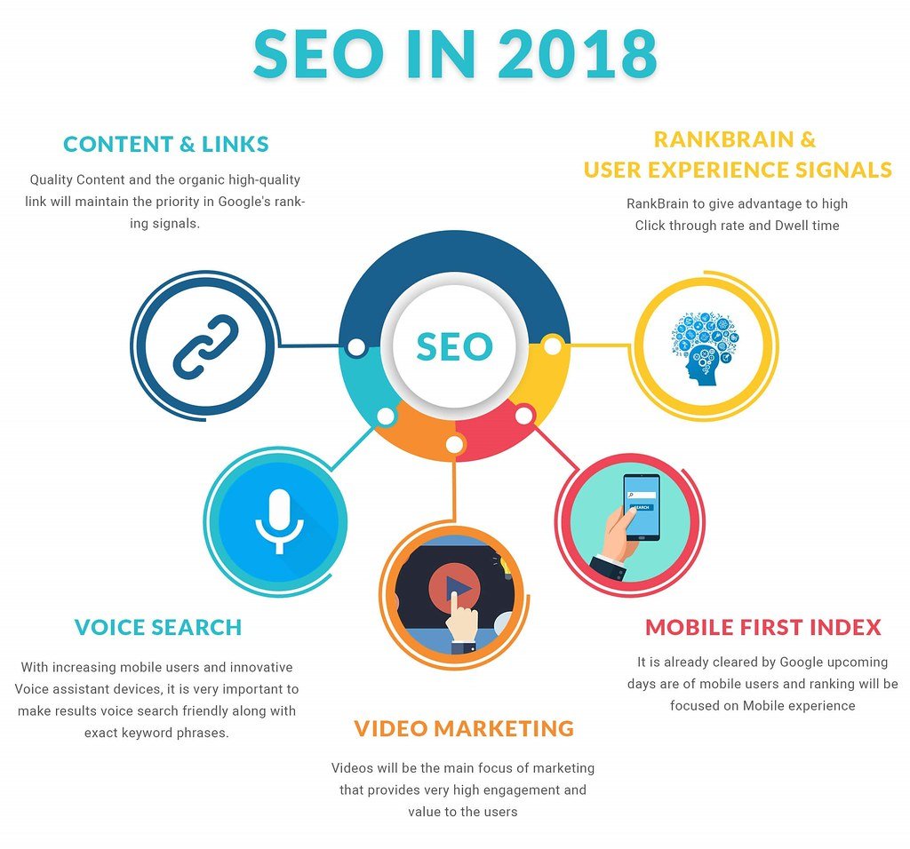
Optimizing Your Website for Mobile-First Indexing: Key Strategies and Best Practices
In today’s digital landscape, it is crucial for website owners to optimize their websites for mobile-first indexing in order to boost their Google rankings. With more and more users accessing the internet through their mobile devices, ensuring that your website is mobile-friendly has become a necessity. To help you get started on mastering mobile-first indexing, we have compiled the following key strategies and best practices:
1. Responsive design: One of the most important aspects of mobile-first indexing is having a responsive design. This means that your website should be able to adapt and adjust its layout and content according to the screen size of the device being used. By implementing a responsive design, you are ensuring that your website is easily accessible and navigable on both desktop and mobile devices.
2. Mobile-friendly content: Creating mobile-friendly content is essential for mobile-first indexing. This involves optimizing your content for shorter attention spans and smaller screens. Consider using shorter paragraphs, bullet points, and headings to break up your content and make it easier to read on mobile devices. Additionally, make sure to use a legible font size and avoid using any elements that may cause difficulties in mobile viewing, such as flash content or pop-ups.
3. Page speed optimization: Mobile users are often on-the-go and have less patience when it comes to waiting for a website to load. Therefore, it is crucial to optimize your website’s page speed for mobile devices. This can be done by minimizing file sizes, compressing images, using caching techniques, and eliminating unnecessary JavaScript and CSS files. A faster-loading website not only enhances user experience but also improves your chances of ranking higher on Google’s mobile search results.
By implementing these key strategies and best practices, you can ensure that your website is well-prepared for mobile-first indexing. Remember, the goal is to provide a seamless and user-friendly experience for your mobile audience, which in turn will contribute to boosting your website’s Google rankings. Stay ahead of the game and make mobile optimization a priority to achieve success in today’s mobile-driven world.
Enhancing User Experience on Mobile for Improved Google Rankings
In today’s digital landscape, having a mobile-friendly website is no longer just an option but a necessity. Mobile-first indexing has become a crucial factor in determining your website’s Google rankings. So, how can you enhance the user experience on mobile to boost your website’s visibility? Let’s dive in and discover some valuable tips!
1. Responsive Design: Ensure that your website has a responsive design that adapts seamlessly to different screen sizes. This will provide users with a consistent and visually appealing experience, whether they are accessing your site from a smartphone, tablet, or desktop.
2. Quick Loading Speed: Mobile users are often on the go and impatient. Make sure your website loads quickly to capture their attention and keep them engaged. Compress images and minimize unnecessary scripts to improve loading times.
3. Mobile-Friendly Navigation: Simplify your website’s navigation for mobile users by using a hamburger menu, which is a popular and intuitive icon. Including a search bar prominently can also help users find what they are looking for quickly.
4. Clear Calls to Action: Encourage user interaction by incorporating clear and easily clickable calls to action on mobile. Utilize bold colors, distinctive buttons, and concise text to guide users towards the desired actions, such as making a purchase, subscribing, or contacting your business.
5. Finger-Friendly Design: Remember that users interact with mobile devices using their fingers, not a precise mouse cursor. Ensure that buttons and links are large enough and have enough space between them so that users can easily tap on them without unintentionally clicking on other elements.
By implementing these user-friendly mobile optimization techniques, you can improve the overall user experience on mobile and ultimately boost your website’s Google rankings. So, start mastering mobile-first indexing today and enjoy the benefits of increased visibility and traffic to your site.
Leveraging Mobile-First Indexing: Expert Recommendations and Successful Case Studies
Mobile-First Indexing has become an essential component of successful website optimization, allowing your site to rank higher on Google’s search engine results pages (SERPs). To help you master this game-changing technique, we have gathered expert recommendations and real-life case studies to showcase the immense impact it can have on your website’s Google rankings.
Key Recommendations for Mobile-First Indexing:
- Ensure your website is mobile-friendly: Evaluate your site’s design and functionality to guarantee a seamless experience for mobile users. Optimize your layout, font sizes, and navigation to make content accessible across different mobile devices.
- Create responsive content: Make sure your website’s pages adapt effortlessly to various screen sizes. Utilize responsive web design techniques to create a consistent and visually appealing experience for your mobile audience.
- Focus on site speed: Mobile users expect fast-loading pages. Enhance your website’s loading time by compressing images, minifying CSS and JavaScript files, and utilizing browser cache.
- Prioritize mobile UX: Enhance user experience (UX) by simplifying your mobile site’s interface, utilizing intuitive touch gestures, and minimizing clutter. Optimize your mobile site for effortless navigation, reducing bounce rates, and encouraging users to explore further.
Successful Case Studies:
Let’s dive into inspiring examples of organizations that have effectively leveraged Mobile-First Indexing to boost their website’s Google rankings:
Case Study 1: Company X
Incorporating Mobile-First Indexing principles, Company X redesigned their website with a mobile-friendly approach. The result? Company X experienced a significant increase in mobile traffic, improved on-page engagement metrics, and a remarkable 30% increase in their Google rankings.
Case Study 2: Organization Y
Organization Y optimized their website for mobile usability by implementing responsive design and reducing page load times. As a result of their efforts, they witnessed a 20% growth in mobile organic traffic, higher conversion rates, and an impressive rise in their Google rankings across multiple keywords.
By implementing these expert recommendations and drawing inspiration from these successful case studies, you can effectively harness the power of Mobile-First Indexing to boost your website’s visibility, engage more visitors, and ultimately improve your overall search engine rankings on Google.
Q&A
Q: What exactly is mobile-first indexing and how does it impact my website’s Google rankings?
A: Mobile-first indexing is a change in the way Google’s search engine crawls and indexes websites. It prioritizes the mobile version of a website’s content over the desktop version. This change implies that if your website isn’t optimized for mobile devices, your Google rankings may suffer.
Q: Why is mobile-first indexing important for website owners and businesses?
A: With the majority of internet users browsing on mobile devices, it’s crucial for website owners and businesses to adapt to this trend. By embracing mobile-first indexing, you ensure that your website has a better chance of reaching and engaging with your target audience, ultimately boosting your Google rankings and increasing your online visibility.
Q: How can I tell if my website is already using mobile-first indexing?
A: You can verify if your website is using mobile-first indexing by checking your Google Search Console. Google will send you a notification once your website has been migrated to mobile-first indexing.
Q: What steps can I take to optimize my website for mobile-first indexing?
A: To optimize your website for mobile-first indexing, start by ensuring that your site’s mobile version is easily accessible to Google’s crawlers. Make sure your mobile pages have the same valuable content as your desktop version. Focus on improving mobile site speed, user experience, and responsive design. Additionally, avoid using separate URLs for your desktop and mobile sites as it may confuse search engine bots.
Q: Are there any best practices for designing a mobile-friendly website?
A: Absolutely! Designing a mobile-friendly website involves adopting a responsive design that adjusts seamlessly to different screen sizes. Optimize page load times by minimizing resource-heavy elements. Use legible fonts, ample white space, and properly sized buttons and links for touch-screen navigation. Finally, prioritize user experience by simplifying navigation, implementing intuitive menus, and optimizing images for mobile viewing.
Q: What impact does mobile-first indexing have on my website’s content?
A: Mobile-first indexing doesn’t directly impact the content itself, but rather how it is perceived and ranked by Google. It emphasizes the importance of having high-quality, valuable, and relevant content available on your mobile site that matches your desktop version. If your mobile site lacks comprehensive content compared to the desktop version, your rankings might be negatively affected.
Q: Is mobile-first indexing relevant for websites with responsive design already in place?
A: Yes, responsive design is an excellent starting point for mobile-first indexing. However, it’s still crucial to verify that your website delivers a flawless and optimized user experience on mobile devices. Double-check that all content is fully accessible, loads quickly, and displays properly across various screen sizes. Constantly monitor and improve your website’s mobile performance to maintain or boost your Google rankings.
Q: How often does Google update its mobile-first indexing process?
A: Google regularly updates and improves its algorithms, including mobile-first indexing. However, the specific frequency of these updates is determined solely by Google. Make sure to stay informed about any announcements and updates provided by Google to optimize your website accordingly.
Q: What are the potential consequences if my website isn’t ready for mobile-first indexing?
A: If your website isn’t ready for mobile-first indexing, your Google rankings might suffer. Without mobile optimization, your site may not appear as prominently in search results when users search on mobile devices. This can result in reduced organic traffic, decreased visibility, and a potential loss of potential customers or visitors to your website.
Future Outlook
As we wrap up our journey through the realm of mobile-first indexing, we hope you have found valuable insights to boost your website’s Google rankings and secure your digital throne. Embrace the transformative power of mobile-first indexing and watch your online presence reign supreme across devices.
Remember, the future of search lies in the palms of your hands. By crafting a responsive and mobile-friendly website, you open the gates to increased visibility and user engagement. Stay vigilant in monitoring your website’s performance, adapting, and evolving alongside the ever-changing algorithms. In this dynamic landscape, you have the opportunity to not only survive but thrive.
Harness the art of mobile optimization, and let your content shine brighter than a thousand suns when accessed on smartphones and tablets. Craft captivating headlines that compel users to click, and offer seamless navigation that effortlessly guides them through your digital kingdom. Cherish every visitor and treat them like noble guests, providing them with a delightful experience that keeps them coming back for more.
It may be a long and challenging journey, but attaining greatness seldom comes without effort. Embrace the challenge, let your passion guide you, and never cease in your pursuit of perfection. Arm yourself with knowledge, experiment fearlessly, and adapt to the changing tides. Remember, your website is not just a portal; it’s your kingdom, your loyal servant, and your most effective tool for reaching the masses.
So, let us embark on this mobile-first pilgrimage together. Arm in arm, pixel by pixel, let us march towards a future where seamless mobile experiences reign supreme, and ranking fluctuations become but a distant memory.
Stay vigilant, be responsive, build bridges between screens, and conquer the mobile realm. As you weave the tapestry of your online presence with mobile-first indexing as your guiding thread, may your website shine brightly and rise among the Google ranks.
Farewell, dear reader, and may your website’s kingdom forever thrive in the vast realm of mobile-first indexing.