

In the vast world of modern technology and ever-evolving search engine optimization (SEO), unlocking the secrets to success can often feel like chasing a mythical creature. But fear not, for a mobile-friendly maverick has emerged from the depths of digital wilderness, ready to reveal the hidden gems of SEO optimization. Prepare to unveil the untamed world of strategic web design and captivating user experience, as we embark on a journey to harness the power of this untamed force. Join us as we explore the secrets, strategies, and tactics that will reignite your website’s visibility and propel it to the top of the search engine rankings. Get ready to become a maverick in the art of mobile-friendly SEO!
Table of Contents
- Mobile Optimization: A Must-Have for SEO Success
- Unlocking the Power of Responsive Design
- Boosting User Experience for Better Rankings
- Optimize Your Site’s Load Time to Dominate Search Results
- Q&A
- Concluding Remarks

Mobile Optimization: A Must-Have for SEO Success
According to recent statistics, mobile searches have now surpassed desktop searches, making mobile optimization a critical element for SEO success. If your website is not mobile-friendly, you’re missing out on a large chunk of potential organic traffic. But what exactly does mobile optimization entail?
1. Responsive Design: A top priority for mobile optimization is ensuring that your website has a responsive design. This means that the layout and content adjust automatically to fit any screen size, whether it’s a smartphone, tablet, or desktop. With a responsive design, you provide a seamless user experience, improving engagement and reducing bounce rates.
2. Fast Loading Speed: Mobile users have notoriously short attention spans and expect websites to load quickly. Having a fast loading speed is crucial for mobile optimization, as it can significantly impact your SEO rankings. Use tools like Google’s PageSpeed Insights to identify any issues that may slow down your website and take necessary steps to optimize it.
3. Mobile-Friendly Content: When optimizing for mobile, it’s important to consider the constraints of a smaller screen. Keep your paragraphs concise and use bullet points or numbered lists to break up information. Utilize bold and subheadings to highlight key points and make your content scannable for mobile users.
4. Thumb-Friendly Navigation: Mobile users primarily navigate websites using their thumbs, so it’s essential to have easily clickable buttons and links. Ensure that your navigation menu is thumb-friendly, with large, easily tappable buttons that are well-spaced. This will improve user experience and increase the time visitors spend on your site.
By implementing these mobile optimization strategies, you’ll not only improve your website’s performance on mobile devices but also enhance your SEO rankings. Don’t miss out on the opportunity to tap into this ever-growing audience and unleash the SEO secrets that will propel your online presence to new heights.
Unlocking the Power of Responsive Design
Responsive design is the key to ensuring that your website looks and functions flawlessly across all devices – from desktop computers to smartphones. With the increasing popularity of mobile browsing, it’s crucial to unlock the power of responsive design to stay ahead in the digital game. Here are a few reasons why you should embrace this mobile-friendly maverick and unleash its SEO secrets:
1. Enhanced User Experience: By utilizing responsive design techniques, you can provide a seamless user experience for visitors, regardless of the device they use. The layout of your website adjusts automatically to fit different screen sizes, ensuring that content remains easily readable and accessible. No more frustrating zooming in and out or horizontal scrolling – your audience will appreciate a visually appealing and user-friendly interface.
2. Higher Search Engine Rankings: In the ever-competitive realm of SEO, responsiveness is a crucial factor. Search engines, like Google, prioritize mobile-friendly websites when displaying search results on mobile devices. By adopting responsive design, you can improve your website’s visibility and boost search engine rankings. This means more organic traffic, higher click-through rates, and increased chances of conversion. Don’t miss out on unlocking the SEO secrets that responsive design holds!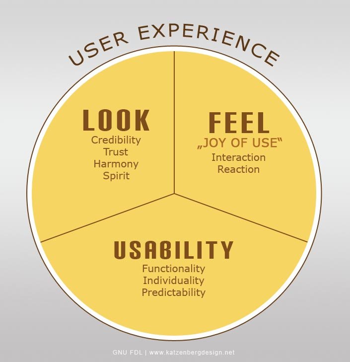
Boosting User Experience for Better Rankings
In the realm of search engine optimization (SEO), user experience holds a special place. It not only determines how users interact with your website but also plays a crucial role in improving your search engine rankings. Boosting user experience is not just about making your website visually appealing, but also about providing seamless navigation and engaging content.
One of the key aspects of enhancing user experience is optimizing your website for mobile devices. In today’s digital age, mobile browsing has become the norm, and search engines have taken notice. Mobile-friendly websites are more likely to rank higher in search engine results pages (SERPs) and attract a larger audience. Therefore, it’s essential to ensure that your website is responsive and easily accessible on various mobile devices. By doing so, not only will you cater to the needs of your mobile users, but you’ll also please search engines like Google, who prioritize mobile-friendly websites in their ranking algorithms.
To further improve your user experience and boost your rankings, consider the following tactics:
– Streamline your website’s layout and navigation, making it easy for users to find what they’re looking for. Avoid clutter and aim for a clean, organized design.
– Optimize your website’s loading speed by compressing images, minimizing the use of plugins, and leveraging caching techniques. Slow-loading websites often lead to high bounce rates, impacting both user experience and search engine rankings.
– Provide valuable and engaging content. High-quality, informative content that caters to the needs and interests of your target audience will not only keep users on your site for longer but also encourage them to share and link to your content, improving your SEO performance.
Optimize Your Site’s Load Time to Dominate Search Results
In today’s competitive digital landscape, the speed at which your website loads can make or break your search engine optimization (SEO) efforts. A slow-loading site not only frustrates users but also sends negative signals to search engines, causing your rankings to plummet. To stay ahead of the game, it’s time to become a mobile-friendly maverick and unleash the hidden secrets of SEO optimization.
So, how can you optimize your site’s load time and dominate search results? Here’s a checklist of simple yet effective techniques to get you started:
– Compress and optimize images: Large image files can significantly slow down your website. Make sure to compress images using tools like Photoshop or online platforms to reduce their file size without sacrificing quality. Additionally, consider using next-generation image formats such as WebP to further enhance load times.
– Minify your code: Clean up your HTML, CSS, and JavaScript files by removing unnecessary spaces, comments, and line breaks. Minifying your code reduces file sizes and boosts site performance, allowing search engine crawlers to navigate through your pages more efficiently.
– Enable browser caching: By enabling browser caching, you can instruct visitors’ browsers to store certain elements of your website on their local devices. This way, when users revisit your site, the browser only needs to fetch the updated content, resulting in faster load times and reduced server load.
Remember, improving your site’s load time isn’t a one-time task but an ongoing process. Continuously monitor and optimize your site’s performance to stay one step ahead of your competitors and ensure a seamless user experience. The faster your site loads, the higher your chances of dominating search results and attracting droves of organic traffic to your digital doorstep!
Q&A
Q: What is the significance of being mobile-friendly for SEO?
A: Being mobile-friendly is crucial for SEO as search engines now prioritize mobile-friendly websites, leading to higher rankings and increased organic traffic.
Q: Why is mobile optimization considered a maverick in the SEO world?
A: Mobile optimization is seen as a maverick in the SEO world due to its revolutionary approach, challenging traditional SEO practices and embracing a mobile-first mindset for optimal user experience.
Q: How does mobile optimization impact website rankings on search engines?
A: Mobile optimization positively impacts website rankings as search engines reward mobile-friendly websites by boosting their visibility, ultimately resulting in better rankings and improved organic search traffic.
Q: What are some essential secrets to mobile optimization?
A: Some secrets to effective mobile optimization include implementing responsive design, optimizing page load speed, improving user interface and experience, utilizing mobile-friendly content formats, and taking advantage of structured data markup.
Q: What role does responsive design play in mobile optimization?
A: Responsive design allows websites to adapt fluidly to different screen sizes and devices, ensuring an optimal user experience regardless of the device being used. This enables better engagement, longer site visits, and improved SEO performance.
Q: How does page load speed impact mobile optimization?
A: Page load speed is crucial for mobile optimization as slow-loading pages hinder user experience and can negatively impact search rankings. Optimizing images, reducing server response time, and using caching techniques are some strategies to improve page load speed.
Q: What are the dos and don’ts of mobile-friendly content formats?
A: Dos for mobile-friendly content include using concise and scannable paragraphs, utilizing bullet points and headings, employing large and legible fonts, and prioritizing visual content. Don’ts include using flash-based designs, displaying intrusive ads, and using autoplay videos without user consent.
Q: How does structured data markup enhance mobile optimization?
A: Structured data markup helps search engines understand and display website content more effectively. This not only enhances the appearance of search results but also improves mobile SEO by providing relevant information in a concise and visually appealing manner.
Q: Are there any potential pitfalls to avoid when optimizing for mobile?
A: Yes, some pitfalls to avoid include neglecting cross-device testing, overlooking touch-friendly navigation, ignoring readability and accessibility, and disregarding the importance of local SEO for mobile optimization.
Q: Can mobile optimization benefit non-mobile users as well?
A: Absolutely. Mobile optimization focuses on improving user experience and accessibility on all devices, not just mobile. By enhancing website performance and usability, it ultimately benefits all users, regardless of the device they are using.
Concluding Remarks
In the ever-evolving digital landscape, where websites come and go, adapting to change has become the new norm. But amidst this cacophony, there emerges a digital maverick, an unstoppable force riding the waves of innovation – the mobile-friendly Maverick. In our quest to unravel the enigmatic nature of SEO, we have delved deep into the untold secrets that lie behind his illustrious success.
As we bid adieu to this enlightening journey, we find ourselves armed with formidable knowledge and an unwavering determination to conquer the SEO realm. With the Maverick leading the way, we are no longer mere spectators but champions in this race for online supremacy.
But what has made this Maverick rise above the rest? It’s his innate ability to understand and embrace the power of mobile-friendly design – a key ingredient to succeed in today’s digital sphere. By seamlessly integrating mobile responsiveness into his website, the Maverick has paved the way for unparalleled user experiences, soaring conversion rates, and astounding search engine visibility.
Through layers of code, algorithms, and analytics, the Maverick has deciphered the secret language of search engines. He has uncovered the hidden treasures that lie within mobile optimization, optimizing his website’s loading speed, enhancing user engagement, and ensuring impeccable navigation on handheld devices.
But what can we, mere mortals of the digital realm, learn from this innovative renegade? It is the imperative realization that mobile-friendly design is no longer a luxury but a necessity. It is the revelation that user experience intertwines with SEO, and together they hold the power to elevate a website from obscurity to prominence.
As we take our leave from the Maverick’s realm, we bid adieu to the unknown secrets and enter the realm of action and implementation. Armed with newfound wisdom, we embark on a journey to unlock our websites’ true potentials, embracing the mobile-friendly path that paves the way to ultimate SEO triumph.
So fellow digital enthusiasts, let us unleash the SEO secrets we have unveiled. Let us become the trailblazers, the visionaries, and the conquerors of the online world. The mobile-friendly Maverick has shown us the way; now it is our turn to grasp the torch and ignite the roaring flames of success.
Farewell, dear readers, as we venture forth into uncharted territories armed with SEO’s greatest secret – mobile-friendliness. Let the journey unveil new horizons and carve our names into the annals of digital history. A new era beckons, where mobile-friendly design reigns supreme, and the Maverick’s legacy continues to inspire generations to come.